Learn everything about CSS media queries—from basic syntax to advanced techniques. Make your website fully responsive for all screen sizes.
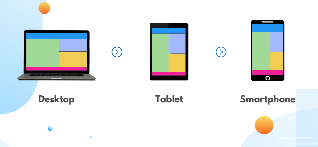
What Are CSS Media Queries? CSS media queries are rules that let your website detect the type of device or screen size being used and apply specific styles accordingly. It’s how modern websites adapt to phones, tablets, laptops, and desktops.
Step-by-Step: Basic Media Query Example Let’s create a simple webpage that changes its background color and font size on smaller screens. This is perfect for beginners.
index.html:styles.css:index.html in a browser.Why Are Media Queries Important? Today’s users access websites from various screen sizes. Media queries help ensure your site looks great and functions well everywhere. Without them, your layout may break or be hard to use on smaller screens.
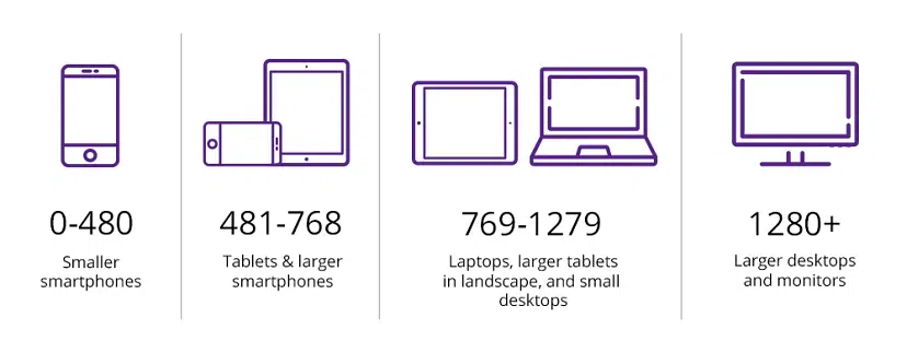
Common Breakpoints to Use: While you can customize breakpoints based on your needs, here are some commonly used ones:
How to Write Media Queries: Media queries use logical expressions to apply styles only if conditions are true. You can check screen width, orientation, resolution, and more. Below are different ways to use media queries with step-by-step examples.
Example 1: Mobile-First Approach with Min-Width The mobile-first approach starts with base styles for smaller screens and progressively adds styles for larger screens using min-width.
styles.css to use a mobile-first approach:index.html in a browser.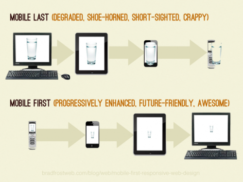
Example 2: Combining Conditions You can combine conditions like width and orientation for more specific styling.
styles.css with:index.html in a browser.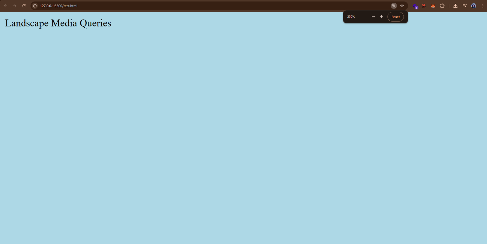
Example 3: Media Types Media queries can target different media types like screen, print, or all.
styles.css to style the page differently when printed:index.html in a browser.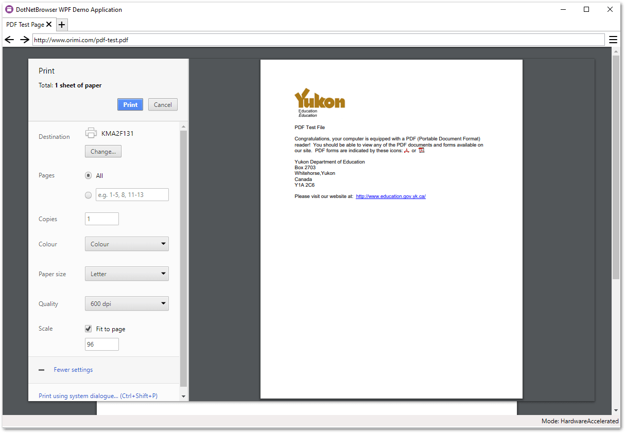
Example 4: Feature Queries Use @supports to check if a browser supports a CSS feature, like display: flex.
index.html to include a flex container:styles.css with:index.html in a modern browser (e.g., Chrome, Firefox) that supports flexbox.Using Developer Tools to Test Media Queries
You can use browser developer tools to test how your media queries work across different screen sizes. Here’s how:
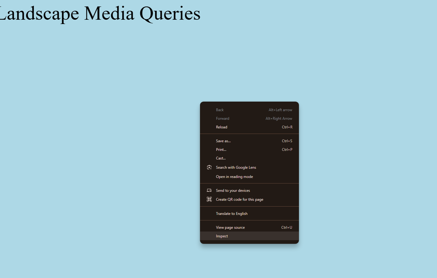
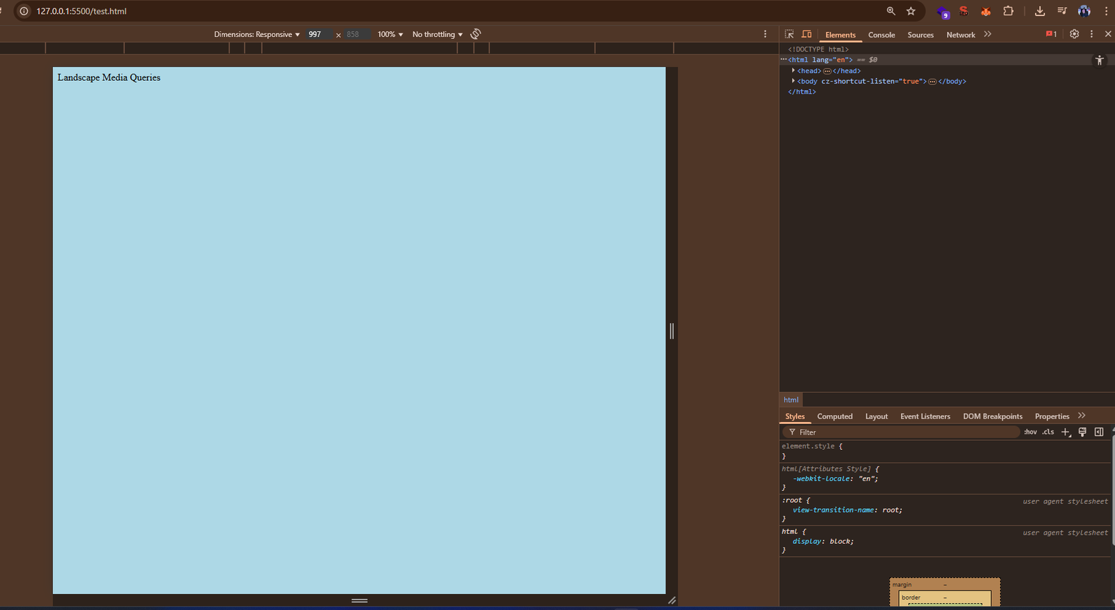
Best Practices for Media Queries
Common Pitfalls to Avoid
Final Thoughts: Media queries are essential for creating modern responsive designs. Practice by building layouts and testing across different screen sizes. The more you use them, the more intuitive they become.
About the Author: Zeeshan Ali is a passionate developer with expertise in frontend, backend, AI, and blockchain. Explore my open-source projects and tutorials on GitHub: Zeeshan Ali's GitHub Profile.